Technical analysis is defined as a set of techniques that aim to forecast the future price or rate of a selected asset. This can be securities, commodities or currencies. Technical analysis is one popular way to determine the future price of Bitcoin. The first part of this article presents the general characteristics of technical analysis, while the rest presents indicators and patterns that are relatively often used to analyse BTC.
The aim of technical analysis is to estimate the moments at which an investor should decide to buy or sell an asset. Technical analysis draws on statistical analysis. To simplify the general characteristics of technical analysis slightly, we can say that the models used assume that the price of a stock follows a recurring pattern.
These patterns may take the form of geometric figures that can be read on a chart, or they may take the form of calculations based on statistical indicators. Technical analysis assumes that prices are subject to trends and that history repeats itself, so that future forecasts can be derived from historical data.
The difference with fundamental analysis is that technical analysis does not take macroeconomic factors into account. The data used to forecast future valuation is read directly from the chart. Although technical analysis differs significantly from fundamental analysis, both methods can of course be applied simultaneously. Fundamental analysis answers the question of what asset is worth buying or selling, while technical analysis explains when to do so.
Bitcoin is a cryptocurrency that almost everyone has heard of. Meanwhile, it is important to note that it was only introduced in 2009. This means that the history of the most popular cryptocurrency is still quite short.
The key operating principle is that it is a decentralised cryptocurrency. With standard fiat currencies, the operation of the currency is based on trust in a central issuer. In the case of Bitcoin the situation is completely different and here the basis is the security provided by the topology of the peer-to-peer network. The network uses blockchain technology, which ensures the security of transactions. BTC is not linked to any banks or governments.
People who hold Bitcoin (BTC) have their own cryptographic key with which they can receive and receive funds. Transactions can be made using software on a computer, smartphone or a so-called cold hardware wallet.
A very distinctive feature of BTC is the setting of the supply limit of BTC units at 21 million units, which exerts strong deflationary pressure. Thus, experts estimate that it is a cryptocurrency that is not exposed to inflation.
With strong deflationary pressures, many people see Bitcoin as a way to hold the value of money over time. Most people interested in Bitcoin think of it as an investment. It is worth noting that this is an asset that is extremely vulnerable to a speculative bubble, particularly as the popularity of Bitcoin (BTC) continues to grow.
Thus, many investors wonder about the right time to enter and exit their investments using different valuation methods. The analysis of BTC is an exciting game, as the price of this cryptocurrency is constantly fluctuating. Variations in valuation occur with all other financial instruments, of course, but it is cryptocurrencies that are characterised by particularly large fluctuations.
Several years of existence of BTC and other cryptocurrencies have clearly shown that the market dynamics are much more lively and restless compared to what can be observed in the stock market or forex market, which of course clearly affects the risk of investment.
Sometimes investors try to predict the right time to enter and exit an investment based on macroeconomic events and industry news. Below we list a few examples that surely could not have escaped anyone who is constantly watching the ever-changing BTC exchange rate.
The above are just a few examples of what has been of interest to those investing in BTC in recent years. However, this is not what is mainly of interest to those focusing on technical analysis. Technical analysis is a more mathematical approach to valuing an asset.
While most of the above has implications for a long-term investment approach, technical analysis uses tools that can be useful for both short-term and long-term strategies.
Of course, the valuation of BTC and other cryptocurrencies does not always have to be correlated with historical data, so the only reasonable solution seems to be a skilful combination of information coming from the market together with technical analysis. In other words, the valuation of a cryptocurrency can confidently be based on fundamental and technical valuation. Nevertheless, not every cryptocurrency enthusiast uses a combination of both methods.
BTC can move in three directions - it can go up, down or hold. If the trend is upwards we call it a bull market, if the trend is downwards we call it a bear market. Some people follow the trend and make their buying and selling decisions this way.
It is important to bear in mind that a characteristic of BTC and other cryptocurrencies is that within a single trend there are many corrections and pullbacks, so many beginners may think that the trend has been broken which is a false observation.
An uptrend or downtrend can contain up to a dozen smaller bounces. For investors who have already spent some time analyzing the BTC price, this is very obvious, but for novice traders, small fluctuations within one larger trend can be a big obstacle to keeping a cool head and staying with a preconceived investment strategy.
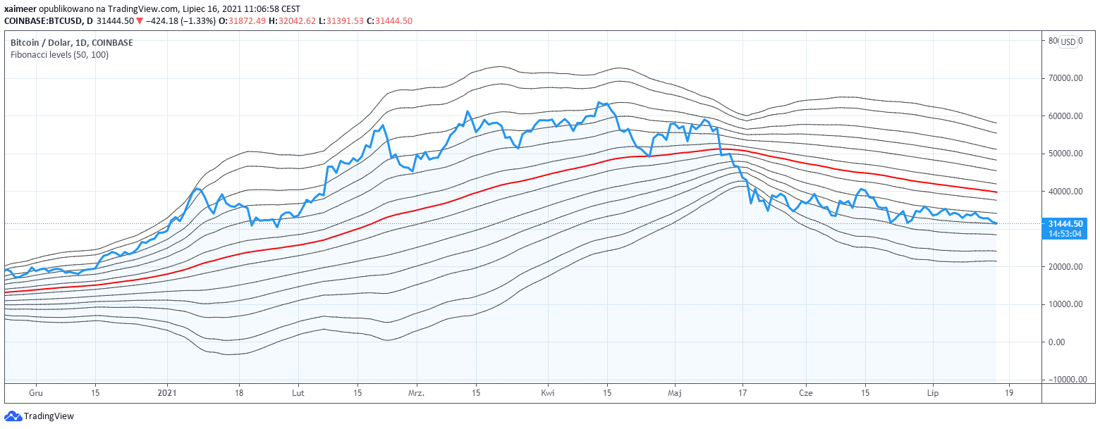
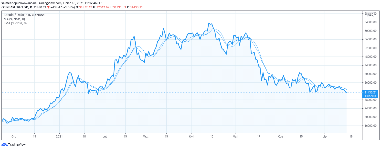
The moving average is a frequently used indicator used to predict the price of BTC. The principle of the moving average allows short-term price flu ctuations to be discarded, so that the result is not distorted by the short fluctuations typical of cryptocurrencies.
A moving average can of course be calculated for almost any time period. However, it has become good practice to calculate an average for 50, 100 or 200 days. Of course, a moving average will not be a good measure if too short a time period is analysed.
When checking the moving averages for BTC, one may come across the exponential moving average, which gives more weight to more recent chart data. Thus, the exponential moving average (EMA) is more sensitive to newer market reports than the standard so-called simple moving average (SMA).
In addition, you will come across many other variations of moving averages. Among them, the weighted moving average (WMA) or the Hull moving average (HMA).
Moving averages are considered to be a good tool for gauging possible price momentum and trend analysis. Keep in mind that the moving average is a lagging indicator and is not recommended for forecasting future movements.
It is a measure used to confirm a visible trend. It is important to know that averages are not an effective tool when the market is in consolidation (sideways trend).
How can moving averages be interpreted? Averages superimposed on a chart are represented as irregularly shaped lines. A common use of a moving average is to superimpose a short term average and a long term average on a chart.
If the short-term average crosses the long-term average on an upward move (this is called a Golden Cross) it indicates a bullish trend. If the opposite is true the trend is bearish (Death Cross).
The basis of moving average analysis is to check how far the calculated average is from the current price. If the price is significantly away from the calculated average then you can expect the price to move in the direction of the average (up or down).
What else should you know about moving averages? When shorter and shorter waves on a short-term average are visible on a chart, it means that a correction can be expected. The flatter the moving average, the weaker the trend.
When we look for predictions of future price movements on cryptocurrency charts, it is very common to see support and resistance points.
A support point is a point below the current price. It is a point which indicates that an upward price movement is likely. A resistance point, on the other hand, is a place that is above the current valuation and is a barrier to the price rising above this point.
Points of this type are identified by analysing past events. Interestingly, there is no single method that determines a support or resistance zone. There are several methods that are based on different data.
The basic method says that a resistance point is a place where the number of sell orders outweighs the buyers' orders which pushes the price lower. In the case of a point, it is the place where demand for an asset outweighs supply.
In addition, data that are sometimes taken into account in determining support and resistance points include:
If a currency returns to a particular support or resistance point several times, the point becomes stronger and more pronounced for analysts. It should be noted that not every point is equally pronounced, so the division into lighter and stronger points is perfectly natural.
When determining support points, it is of course necessary to determine for which time range we want to determine support and resistance points. In the case of BTC, traders generally look for points on multi-month or multi-year charts.
The determination of points is a step towards the determination of support and resistance lines and levels. Several points on a chart that can be connected by a horizontal line define a support zone or resistance zone.
Fibonacci levels are another popular example of technical analysis. It is a method that uses what is known as the golden division. This is the division of a segment into two parts in such a way that the ratio of the length of the longer part corresponds to the ratio of the length of the longer part to the length of the whole segment. In simple terms, it is simply the number 1.61803 39388. This number is derived from the formula below.
The golden ratio is an unusual number in that it is repeated in many different aspects of life. It is a number that is considered to be the natural proportion of different things occurring in the universe. In other words, modern science notes that the golden ratio occurs in many different areas.
Among others: painting (preservation of proportions), architecture (e.g. proportions preserved in the construction of the ancient Pantheon), biology (cycles of brain waves, diagram of the arrangement of the human body, leaf nerves), optimisation (golden ratio method), mathematics (wide application, the most popular is the connection with the Fibonacci sequence, besides there are many more similar examples), finance (analysis performed on financial markets).
According to the Fibonacci golden number the ratios of 0.382 (38.2%), 0.500 (50%), 0.618 (61.8%) are used in technical analysis. Each successive level is greater than the previous one by 1.618. This application of the golden number in the financial markets is known as Fibonacci arc or Fibonacci retracement.
These levels are used to determine support and resistance levels. Usually three arcs (there may be more) are drawn on the chart, which are oriented towards a local peak or low. The arcs cross the trendlines between the last maximum deviations. The general premise for the use of such levels is based on the theory that as the price moves in a trend it is possible for the price to break out or retreat to certain levels which are linked to ratios derived from a golden number.
Fibonacci segments can also be plotted on a timeline. In this case they take the form of vertical rather than horizontal lines. This means that the time period between the occurrence of an extreme in the valuation of a specific financial instrument is measured.
Critics of the use of Fibonacci levels point out that the identification of a number of fairly universal minima and maxima naturally increases the probability of the price stopping at one of the levels plotted on the chart.
Relative strength index, known as RSI, is an indicator that determines the strength of a trend. It is a highly regarded relative strength indicator which is used to measure the speed and change of price movements. It is based on data from a selected time frame. The RSI is highly regarded and has proven itself time and again to be one of the most popular indicators used in technical analysis. It is based on a moving average and takes values between 0 and 100.
To calculate we need A) the average value of the closing price increase from y days and B) the average value of the closing price decrease from y days. Dividing one value by the other (A/B) gives the RSI.
Usually RSI above 70 is a sell signal. A low level of the indicator reaching below 30 is a buy signal. Of course the interpretation is only conventional and it depends on the trader's strategy what level of the RSI indicator he/she decides is sufficient to buy or sell on that basis. Some traders, for example, use levels of 80 and 20 points.
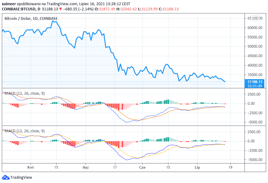
MACD - moving average convergence/divergence indicator. MACD measures the strength of a trend and provides sell or buy signals. This indicator is based on the difference between different moving averages.
The moving averages most commonly considered are the EMA (exponential moving average) and the SMA (simple moving average). In practice, the long term average is subtracted from the short term average. Typically a 26 and 12 period average is used. An auxiliary signal line is needed for the MACD. This is the average of the resulting MACD line (usually in the form of an exponential average). On a chart MACD takes the form of a line or histogram (so-called vertical bars).
If the MACD line crosses the signal line climbing from bottom to top on the chart, it can be taken as a signal announcing an upward trend (thus encouraging buying). If, on the other hand, the signal line is crossed from top to bottom, it is a signal recommending selling. In simple terms, the MACD indicator helps to see the difference between the different moving averages and thus enables the trader to identify the trend more accurately.
The task of a stochastic oscillator is to measure the degree of price change between prices from one period. This action can confirm or deny a trend. This oscillator is based on the observation that in an uptrend, prices are usually close to the upper end of the price range. In downtrends prices tend to move towards the bottom of the range.
n - number of periods, Maximum or minimum price from a specified number of periods back.
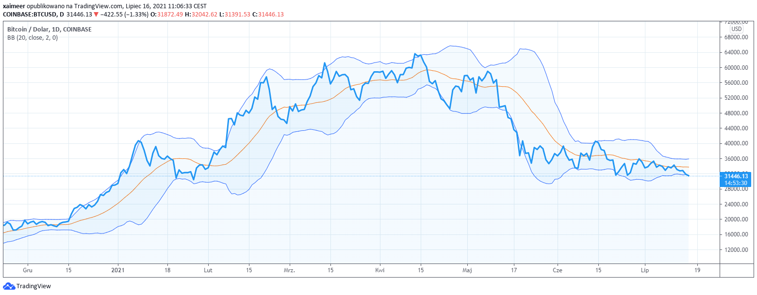
The bands define the lower and upper price limits. The middle band is the n-period moving average. The upper band is k times the n-period standard deviation above the middle band. The lower band, on the other hand, is k times the n-period standard deviation below the middle band. Usually the value of 2 is taken as k. Whereas n = 20 periods. Bollinger bands plotted on the chart very clearly represent market volatility. From the investor's point of view it seems to be reasonable to sell the asset when the price approaches the upper limit, and to buy it when the price is closer to the lower limit.
Parabolic SAR is an indicator which determines on the chart the levels of trend stops and reversals. Without going into the details of how this indicator is calculated, it is enough to note that the indicator generated with the help of an analytical tool by means of intuitive dots shows areas below or above the price. Dots below the price indicate an uptrend. Dots above the price indicate a downtrend.
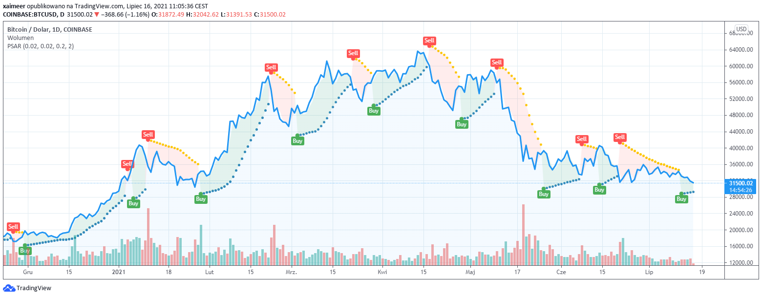
Buy when the dots on the chart are below the current price. The moment to sell is when the dots are above the current price. Interestingly, according to COMPARISON OF THREE TECHNICAL TRADING METHODS VS. BUY-AND-HOLD FOR THE S&P 500 MARKET by Timothy C. Pistole based on 17 years of research found SARs to be as high as 95% effective. Of course, this is not a study done on the basis of BTC, but it nevertheless confirms that Parabolic SAR is an indicator worth knowing about.
According to Eliot wave theory, the valuation of an asset changes in accordance with cycles based on Fibonacci number sequences. According to the theory, the market moves using a certain number of peaks and troughs. This indicator is based on the analysis of the natural rhythm of crowd psychology in the market. Therefore, Eliot waves are applicable in markets which have many participants. It is an indicator that is readily analysed in the case of BTC.
A head and shoulders is one of the most frequently mentioned patterns when analysing BTC. It is the point at which an uptrend slowly begins to lose momentum. Thus, a characteristic pattern appears, conventionally resembling a head and shoulders. This is a classic of technical analysis and one of the basic price structures for reversing an uptrend. It is a structure consisting of three maxima. The left peak is the left shoulder, the middle peak, or so-called head, is the highest peak, followed by a third lower peak which is the right shoulder.
In addition to observing the pattern on the chart, it is also important to note whether the trading volume at the time of the head formation is smaller than at the time of the left shoulder formation. This is a characteristic moment announcing the weakening of the uptrend. During the right shoulder, the trading volume should be even smaller. Confirmation of a successful chart reading should be a subsequent price decline. A trader who notices such a pattern on the chart should consider selling to protect himself from a decline in valuation.
So-called pennants are an example of a pattern indicating a continuation of a trend. This is a situation in which there is a large movement (e.g. upward) followed by a period of consolidation. The chart at such a time resembles a flagpole. The consolidation period should have a lower volume, while the breakout moment is accompanied by a higher volume.
Pennants are an observation that should set investors bullish. In a pennant, price movements regularly weaken until the next breakout occurs. A trader who observes pennants may use the moment when the price consolidates resembling a flag to buy a given financial instrument before the expected breakout. Many traders combine pennants with other technical analysis indicators e.g. RSIto confirm their observation.
An upward wedge is a pattern on a chart that can be observed during short rises in prolonged falls (or during the last phase of a bull market). We call a wedge a pattern on a chart in the form of ups followed by downs. Usually these ups and downs have at least 4 turning points. In general, during the so-called wedge, the upward trend is maintained, while the volume of transactions decreases.
When ups and downs start to get smaller and smaller it may be a signal that the price is falling. On the surface it sounds quite complicated, but if you look at the charts you will quickly see that it is not very difficult to recognise a wedge. A similar situation is a descending wedge, which also consists of at least four turning points. In a descending wedge a price rise is announced which suggests a buy decision.
Triangles are an example of a pattern indicating a continuation of an earlier movement. This type of pattern is defined by two converging lines drawn through two maxima and two minima. Thus, four points and two lines are drawn.
In simple terms, if these lines converge to form a triangle then we can speak of an expected continuation of the trend. Triangles may take the form of a descending or ascending triangle. Triangles can take the form of either a descending or an ascending triangle. A higher top indicates a bullish bias. Conversely, a low triangle peak indicates a bearish outlook.
We speak of divergence when there is a noticeable inconsistency between information from indicators and chart patterns. The observation of divergence should be a signal that increases the likelihood of a correction.
An element not to be missed is the analysis of Japanese candlestick charts. Each candlestick is a description of the price action during a specific time period. A candle is formed based on the opening price, the maximum price recorded and the lowest price recorded in a given time unit.
Thus, reading data from a candlestick chart provides full information about the current and past valuation of a financial instrument. If one looks at a chart with hourly intervals, then viewing the data for one day one will see 24 candles on the chart, with each candle indicating the behaviour of the candle during a specific hour. For a 15-minute interval this would be 96 candles for one day. Which components make up a candle?
When reading candlestick charts in addition to reading dry valuation data one can also see signals for the future. For example, if long wicks are seen at the top of uptrend (bullish) candles it may mean that the strength of the uptrend is declining and the trend may soon end or a new trend with a different slope may emerge. Long wicks on top of downward (bearish) candles, on the other hand, may indicate a trend reversal.
In addition, candlestick chart analysts read signals on the basis of candlestick patterns. Skilled analysts are able to identify a dozen or even several dozen different candlestick patterns that may suggest bullish or bearish signals. Some simple examples are given below.
Falling star - this pattern resembles an inverted hammer. Small body, small (or no) lower shadow, clear upper shadow. It is a pattern that signals a decline after an uptrend.
Candlestick Three black crows - three red declining following candles that are bearish signals.
Doji - a candle whose opening price and closing price are the same. A Doji candle has no body and consists of a wick. It is a sign of indecision which can indicate a significant change in the market. A doji that is built from a long bottom account can be interpreted as a subtle sign of an upcoming bull market. A long upward wick, on the other hand, may be a subtle sign of an upcoming bear market.
The answer to the question about the effectiveness of technical analysis cannot be clear-cut. Technical analysis is certainly a useful tool as it structures certain repetitive market behaviours. Traders who take technical analysis into account and see certain patterns have a certain advantage over traders who do not take technical analysis into account during their analysis. Indicators such as RSI, stochastic oscillator, MACD and many others can be found on stock market platforms.
A modern investor does not need to go through the trouble of calculating them, but the most difficult thing remains for the investor to do, which is to interpret them correctly. Almost every cryptocurrency, including BTC, has certain repetitive patterns that cannot be ignored. Acquiring knowledge of technical analysis and adding fundamental analysis to it can be very helpful in gaining an advantage in a competitive market.
Table of Contents


